Here a the panels:
 (The front of the digipak. I changed quite a few things on this picture. First of all I put on a slightly red filter, then worked on changing the saturation, also making them more red. I blurred the background - the forest trees, so as to make sure that the main focus of the cover was Emily. I also made the lighting much brighter and harsher to emphasise the beautiful colours of the autumnleaves.
In reality Emily's eyes are lighter but the photo had made them darker, so I used the lightening brush tool to go over her iris to to make it lighter. I also tried to make her lips darker [since during the filming the lipstick had worn off by the time we took this photo], so they stood out on her ivory face, making the close up that much more dramatic. When looking at the photo herself she thought that her spots and her teeth made her seem unattractive, so I airbrushed the spots out, using a cloning and blurring tool, and whitened her teeth slightly which also contrast stongly with her red lips. I also added several strands of hair infront of her face just to make her look windswept and indeed feeling like she has "fallen."
Finally, the title and the name were in a curly font, which we thought was important to have to fit in with the feminie and fantasy-like theme. I had to make a white shadow just so a viewer could see the writing more clearly against the colourful background.)
 (The back panel of the digipack. I similarly tried to make the image more 'warm' with filters and light changing. I had to keep tracing around the floor, being the most 'dullest' part of the photo, and adding quite a deep red filter to make it look better. The lightening here was darker on edges, while I lit up the actual objects.
I traced around Emily's dress and shoes, unlike the rest of the picture, and made it very light and took away all colours - trying to make it almost glow, and help connotate her innocence and purity.
I ended up cropping the right side if the photo, and having her left side seem more bigger, pushing Emily to the right, so the track would look better.
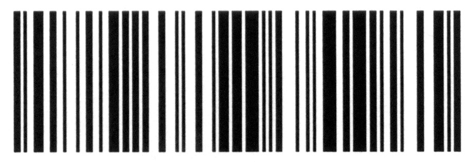
While adding the copyright information at the back, I had to being out one of my own albums that I owned so I could structure it correctly. The bar code was taken off here, and you can probably notice the absemce of number beneath, since we didn't want to unintentionallytake someone else's barcode number which might not be allowed. The logo was cut and pasted on from the site.
The tracks were done in the font "Lucinda Handwriting" and the numbers are in "One Stroke Script." The numbers were chosen purely because they could be seen clearly in that font. The track titles we had to think about more carefully. In the end, I blurred the area behind the track listing, which allowed us to have the font we wanted since the out of focus background leaves the viewer able to read the tracks. We wanted a white font so that something else on the panel was white, going with the dress.
Finally, the same changes that were done on Emily's face on the front cover, was done here but on a smaller scale and with less care since her face is not seen that clearly anyway, and is not the main focus on the picture.)
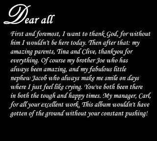
(The first page of the 'thankyou' page. Here I just put up a blank black page, and used several text boxes towrite down her message. We know straight away we wanted some sort of curly, fancy writing to fit in with our fantasy-like theme, we were going to use "Lucinda Handwriting" or "Vivaldi," however they were both hard to read in that size font. In the end I downloaded a font from here in the curly section called "jiggle" which we all agreed looked good.)
(The second-page of the mini booklet - it did end up running on to 2 pages. The main blocks of text are same as the first page, as are the letters on Emily Quinn's name, except for the E and the Q, which I used "Palace Script MT."
The change in size font was done since we thought it would emphasise that in the end, this whole project was for and about Emily. It also gave it a signituare like look, making it more personal from Emily to her fans.)
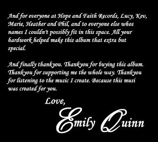
(The middle slide, and the picture we chose was this one and not the other one where Emily was standing behind the tree, was because it went with the leaves picture that would be behind the CD holder - it would seem as if that is where she was lying before, but now she is gone.
Here I used the exact same effects as the levaes image, so as to try and make them as similar as possible to try and give the effects which I have just mentioned above.)
The images, including the one beneath the CD's transparent plastic place holder, which is also the background of the website and from a scene in the 'Fallen' music video, hopefully whows that we've really thought how we need to try and make it intertextual, that they all need to promote the same artist together.
- Sarah El-alfy


